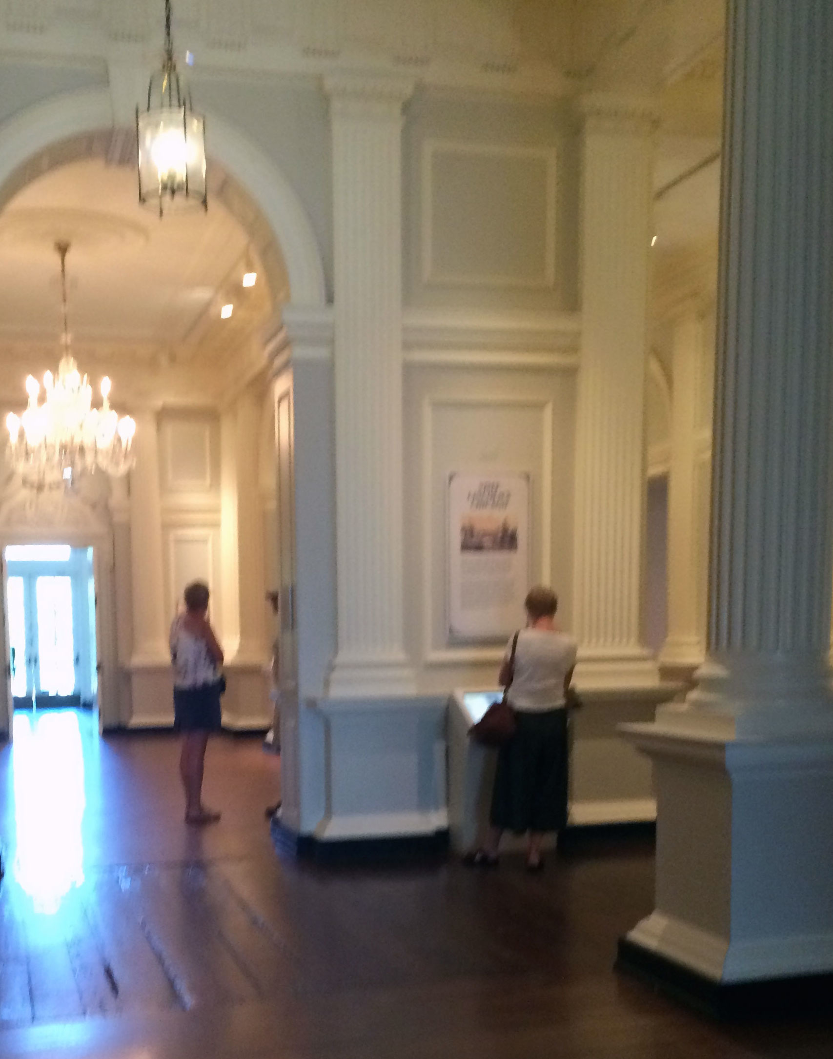
Touchscreen Kiosk
In Fall 2011, a touchscreen kiosk was installed in the exhibition gallery to augment the richness of the exhibition by allowing museum visitors to explore images of historic Chicago locations through an interactive journey.
Objectives
- Engage visitor’s imaginations.
- Create a virtual visit to the city’s past.
- Leverage exhibition’s lithographs and close-up details.
- Create a sense of “being there” for users.
Responsibilities
Assisted with design review, user greeting/on-boarding, contextual inquiry, and usability testing.
The Experience
Users begin their journey via train, arriving at Grand Central Depot. Their first destination is Sherman House, a hotel that serves as a launchpad for the visit. While traveling from location to location, the user will examine objects in the scenes to learn additional knowledge. The touchscreen activity will create a user experience that lets visitors re-live an earlier era of Chicago history. An 1863 map of Chicago provides users with a consistent orientation to place and time.
Design Review
Our design review was conducted by two staff members (myself and my supervisor) on the latest version of the application running on the new Dell Windows 7 Professional kiosk computer.
Screenshots of the activity we reviewed:
Takeaways:
- Emphasize the train experience
- Refine and speed up instruction sequence which teaches users how to zoom and maneuver around images
- Remove sequential tour menu loading sequence to prevent users becoming impatient
- Remove cumbersome and redundant arrow navigation keys as user is already taught how to drag images across the screen with their finger
- Incorporate "farewell" button into the design
- Visited tours should be grayed out when they have been visited.
- Change color of "you are here" map flag to red to increase visibility
- Remember that the "you are here" point changes once a user selects a tour attraction
- Animate the attraction destination copy to capture users' attention that something has changed.
- Fix glitch that makes map disappear
Contextual Inquiry and Usability Testing
We wanted to identify friction points in the activity's design as encountered by a real user in the natural environment of the touchscreen kiosk. Not only was it important to find out if the activity itself worked well, but to know if the kiosk itself was well-suited to the gallery space, or if things like background noise, visitors and school groups, and events in the adjacent room would negatively affect the experience.
I took a quick video of the Museum's exhibition environment at closing time to illustrate what the space looks like. Each display window has interactive audio that plays out loud in the gallery when a museum visitor presses a button.
We focused on:
- Navigation: Are users able to easily decide on a tour? Explore, move, zoom-in and out of images? Move from one tour to another? Exit the activity?
- Readability and Comprehension: Do users struggle to read copy? Identify and understand instructions and content? Notice dialog boxes?
- Fatigue: Does the position or dimensions of the kiosk cause physical strain?
Test Results and Takeaways
We tested the kiosk with 5 Museum visitors -- 3 male and 2 female, ranging from ages 18-50. The following usability issues were observed during the test:
- 3/5 users had a difficult time exiting the activity from the Map screen, because there is no exit option on that screen
- 3/5 users did not immediately find the zoom controls, 4/5 learned about the zoom functionality and were pleased with it.
- 3/5 users tapped this element, it does nothing.
- The Sherman House marker blends in with the rest of the markers, but it is not part of the tour. It is the “launch pad/you are here point”. 3/5 users selected it on the map and did not expect to return to that screen.
- 2/5 users were not aware when they had completed a tour
- 1/5 users did not see the detail copy
- 1/5 users had a difficult time remembering what tour they had already visited, when selecting a new tour from the menu.
- 1/5 users tapped the intro sequence, perhaps to skip it or to activate something
- Technical Bug: The cultural attractions tour description copy was appearing outside of the cultural attractions tour e.g. it appeared in the waterways and South Side tours.
Final Product
Teaser trailer for the “Visit Lincoln’s Chicago” interactive touchscreen activity currently installed at the Chicago History Museum, created in conjunction with Mightybytes:
Website
In Spring 2014, a companion responsive website was launched to allow our audience access to the touchscreen kiosk content online. See the final product: http://chicagohistory.org/visit-lincolns-chicago
Responsibilities
Assisted with visual design and responsive web development
Built with
HTML5, CSS3, JQuery, Foundation 5
Used
Microformats, Open Graph, SEO, Adobe Photoshop


